
Websites
Build and monetize your online presence with a fully integrated website - from digital products to e-commerce sales.


Move your audience off social media and own your relationship with them

Use the right metrics, organized into reports you’ll actually use.
Automatically collect, respond to, and analyze customer feedback from email, SMS, Google My Business, and Facebook.

Automate Instagram and Facebook DMs to capture leads, deliver offers, and drive sales — even while you sleep.

Build dynamic landing pages without needing a designer

Create marketing emails worth opening

Automate and scale with Amply360’s proven, ready-made Funnels
Create and manage Workflows to automate business processes, improve efficiency, and increase conversions.

Plan, schedule, and publish content across platforms, so you stay consistent without the chaos.

Engage leads 24/7 with intelligent chatbots that qualify, nurture, and convert — automatically.
Quickly find the right help for where you’re at

Curated expert insights and process to grow your business
Refer a friend and earn lifetime commissions for each activated referral

Official Facebook Group to connect with fellow AMPLY Aces, ask for help and get feedback


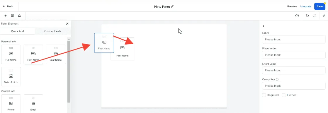

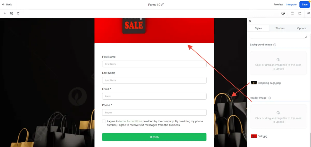

Best Practice: The Rule of 3 (Why 3 Fields Crush 10)
If you want to skyrocket your conversion rates, stop asking for everything at once. Data shows that forms with 3 fields convert up to 25% better than those with 6 or more.
1. Friction is the Conversion Killer Every extra field you add is a "micro-hurdle." By the time a lead gets to "Phone Number" or "How did you hear about us?", they’ve already decided that whatever you're offering isn't worth the manual labor. High-converting forms respect the user’s time.
2. The "First Date" Rule You wouldn’t ask someone for their home address and annual income before you’ve even bought them a coffee, right? Your form is the first date. Keep it light:
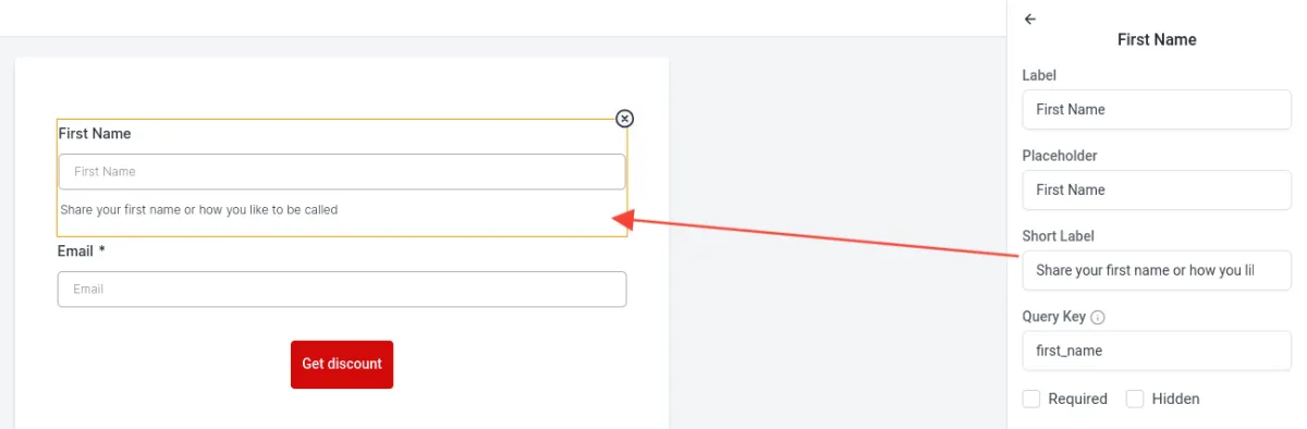
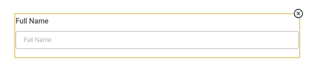
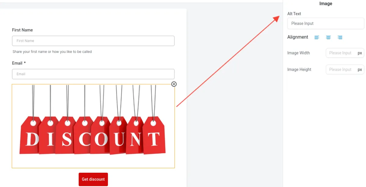
First Name: To keep it personal.
Email: To keep the conversation going.
The "Big Pain" Question: One simple dropdown or text box asking what their #1 struggle is. This qualifies them without feeling like an interrogation.
3. You Can Get the Rest Later (Automate It!)
This is where Amply360 works its magic. You don't need 10 fields on the first form because our automation takes over the moment they hit "Submit."
Phase 1: Capture the lead with 3 fields.
Phase 2: Use an automated "Thank You" email or a secondary survey to gather deeper details once they are already "in" your ecosystem.
The Bottom Line: Asking for less upfront actually gives you more data in the long run because you'll have more people entering your funnel. Don't let a long form be the reason a high-quality lead walks away.

Amply360
The all-in-one business platform built by a mom entrepreneur, for solopreneurs and business owners who'd rather grow their business than troubleshoot software.
© Amply360 | All Rights Reserved.


